
Branding & Print
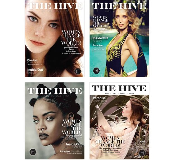
HIVE Magazine Pitch
Even though I was wrapping up my print work in favor of directing video content and other engaging experiences, I got a request that I had to follow through on. I mean, one doesn’t ignore a yank back into the past when the Queen Bee herself — Beyonce — and her team happen to be the client. So with the impossible deadlines and all, of course I jumped into the project, creating a pitch for a new magazine. They loved the look I created.
The process was amazing! A small group of us had two days to create the entire deliverable and the following week to clean it up and load it all into a presentation. I am still quite proud of the creative result even though they never were able to resolve the financials and the publication never launched. It was still an amazing idea.

Essence Redesign
Essence magazine was such an eye-opener for me in so many ways. My redesign pitch was in honor of the women who see this publication, its assets, and events as a proud black voice through both brilliant moments and difficult times. I created a place where the images celebrated every part of the brilliant diversity and uniqueness of Black women. I wanted them to see themselves as the celebrities, innovators, fighters and victors they are.

DAC (Dumbo Arts Center)
As with so many of the things I got involved with in my life, The DUMBO Arts Center was a wild learning experience and was deeply influential in my overall life ideologies.
I was the Brand Creative Director, Co-Founder, Vice President, and Director of the Applied Arts at the center. As Brand Creative Director, I developed their visual identity. Using the architectural look of the neighborhood to create the logo, I then added as many industrialized elements and mechanical processes as possible to keep all our promotional material strong and feeling very much like the raw industrial neighborhood it was at the time.
the first opening invitation (shown here) was printed on metal.
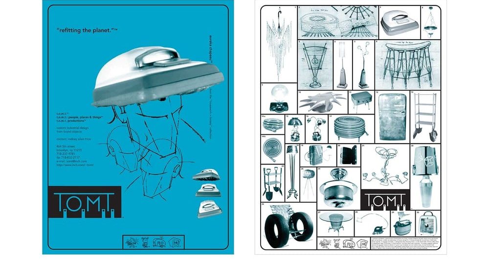
T.O.M.T. (The Other Man’s Treasure) & Refit Or Die
T.O.M.T. (the other man’s treasures) stemmed from a childhood of constantly building and making. That hands-on engagement with materials only grew when I moved to New York City. Like so many other creative people, I dragged home great finds from the trash to uniquely design my living spaces. Everyone did it, but I took it a step further by transforming vacuum cleaners, crutches, piano harps, mannequins, doors and tires!
And then to develop the evolving brand identity of this outlet was thrilling.
You can find the whole evolution of that pursuit here at REFITTING THE PLANET & REFIT OR DIE.
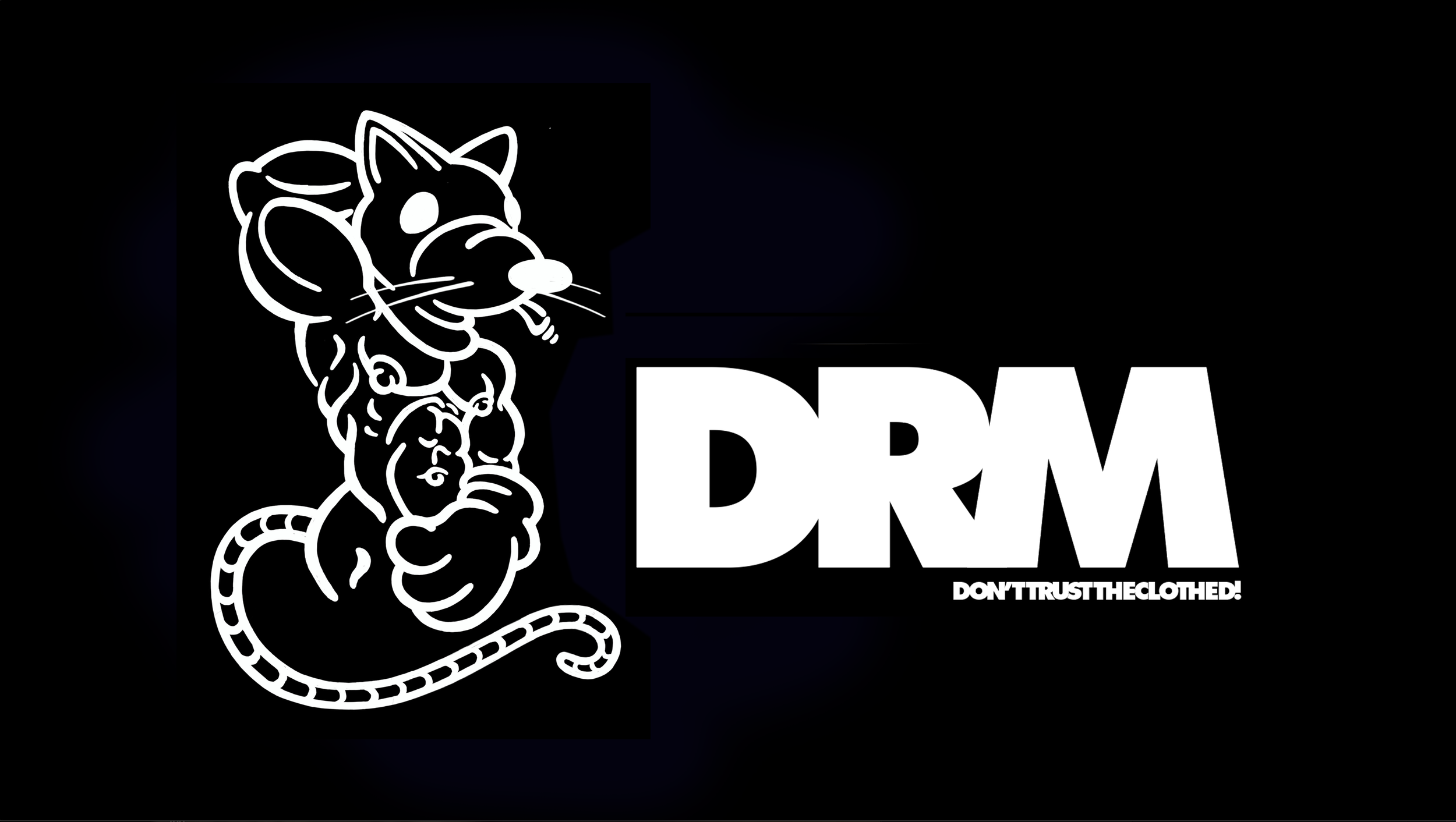
DRM (Dirty Rat Media)
For those of us in the LGBTQ+ community, we are just beginning to live in an amazing time as we find greater acceptance in “polite society.” There were so many of us who came out in 90’s who feel we are throwing out a significant part of our history as we embrace acceptance. Now as we’re less on the outskirts of society, it seems as if we’re leaving behind our wild trumpet blast of freedom for smart trousers, Izod shirts and memberships at local country clubs, community organizations and PTA. Dirty Rat Media is a content development outlet for a more sexually charged expression; an alternative space for those who still need to scream a little bit and maintain contact with that wild stud or queen diva side of themselves. #proudandloud

Prevention Magazine
One of my greatest publishing challenges was Prevention magazine. This digest-sized publication has a smaller trim-size than your standard magazine (5.25” X 7.375” versus the more traditional 8.25” x 10.75”), and with content that required accurate and detailed information every page was a shoehorning obstacle course. Still, while designing within those constraints, there was a straightforward ‘form follows function’ beauty that arose.

RVLiving Magazine
When the UK’s John Brown Publishing needed a creative director to cover maternity leave during the launch of this new project (a magazine geared towards the upscale RVing Baby Boomer), I had no idea what I was getting into. Often not-so-lovingly referred to as ‘the trailer magazine’ by the mostly fashionista staff, no one seemed to have any idea what was in store.
Launching this project with tight deadlines and a skeletal staff was daunting; but the moment the right team was assembled, we burst onto the scene and surpassed everyone from the competing motorhome magazines to other custom publications. I won more awards for this project than any other, including ‘best new launch’, ‘overall design’ and ‘best use of illustration’.
This team was stellar. I miss them and we all dream about the day we can reunite creatively and surprise the world again.

Teenbeat Magazine
At one point in publishing there was a tremendous swelling of titles focused on the youth/teen market. Due to the younger audiences for some of my new projects it seemed exploring this demographic became relevant in the bigger picture once again. The inspiration that started here continues to influence my development of augmented reality experiences and game design through my observation of this audience demographic and the mass behavioral changes that were beginning when I was in this publishing genre.
Working within this demographic at that time really had a lot of influence on much of what I do now.

Books
Most of my publishing work was in the much faster-paced magazine industry, but on occasions I was given the chance to work on a book. Here are some of the book projects whose design I directed.

Birdhaus Project
BIRDHAUS is a project that was inspired by old sneakers that get tossed over power lines in urban environments everywhere. This project is a kit in a box that provides all the parts you need to turn one of your own old high top sneakers into a birdhaus.
A play off of the craft movement of the Bauhaus influenced the name.
rat@refitordie.com | 646-772-6697